Harmonie
Science and nature, brought into harmony. A connected identity for Harmonie Derived Naturals by Momentive.
Industry
Beauty & personal care
Services
Brand identity
Packaging
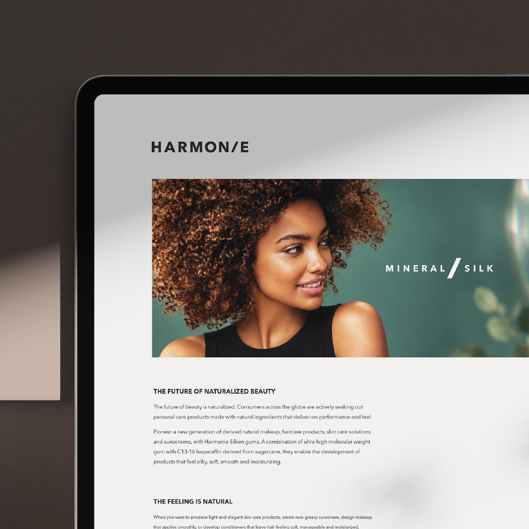
Website
[01] / THE STARTING POINT
A meeting of science and nature
Harmonie brings naturally derived ingredients into the science of personal care. Using plant and mineral feedstocks—including sugarcane-derived carriers within its silicone gum blends—the range helps formulators increase natural-origin content while delivering the feel and performance people expect.
Its ingredients can work across hair care, skin care, sun care and colour cosmetics, including lip products. That breadth created a distinctive branding challenge: how do you make invisible ingredients feel tangible, natural and relevant across so many different beauty applications?
[02] / THE DIRECTION
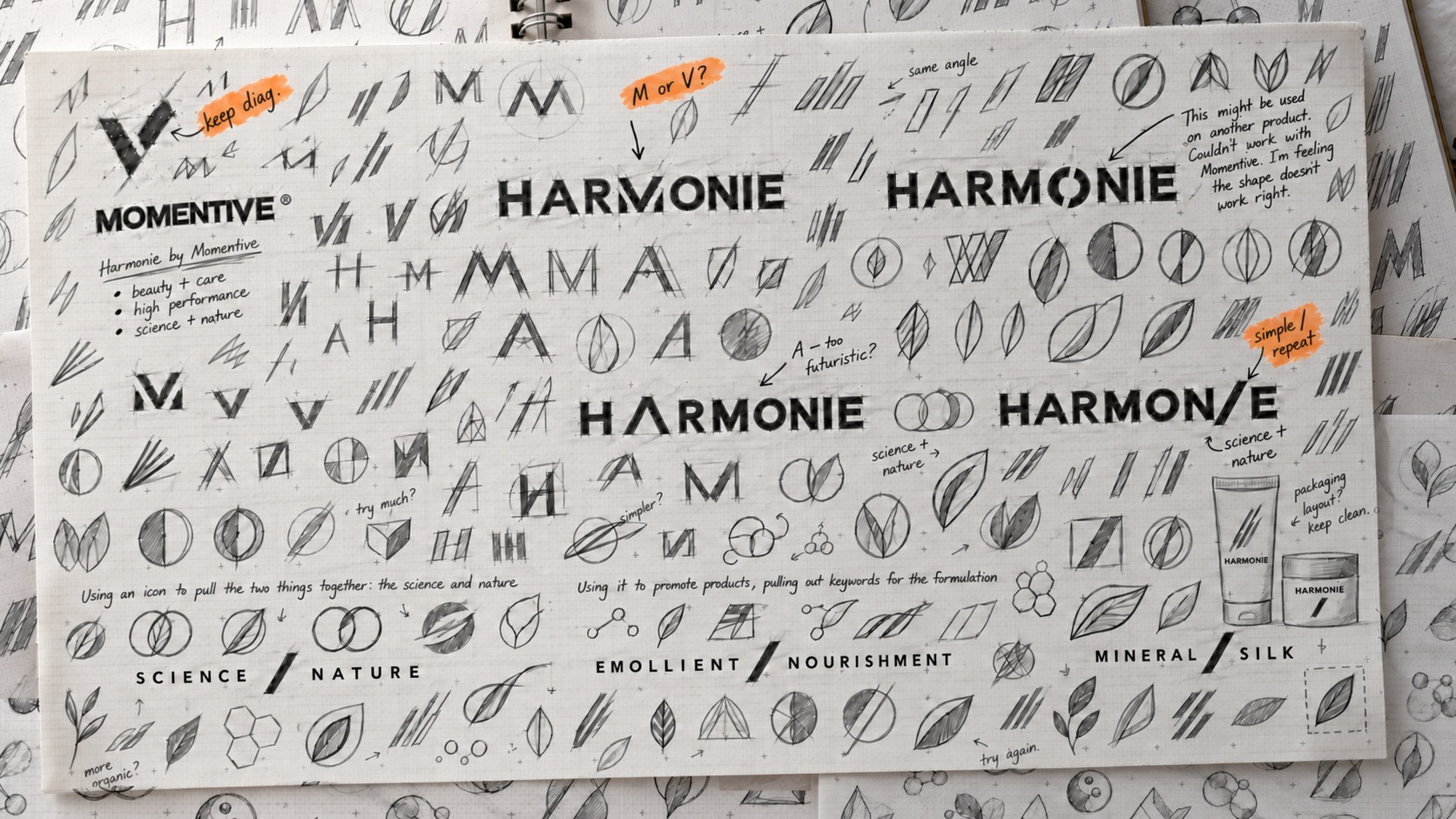
One simple mark. A shared language
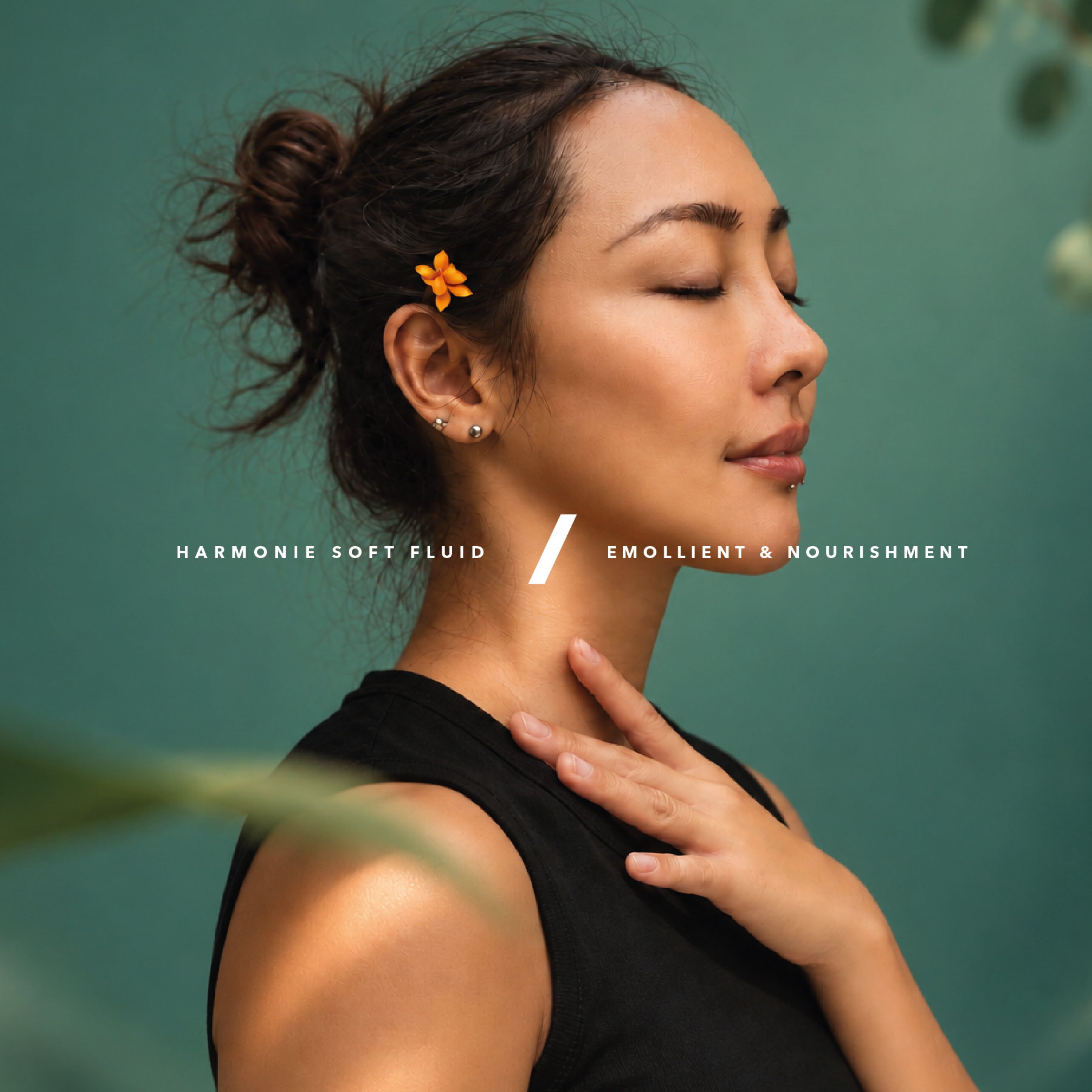
The diagonal slash sits at the heart of the identity. Within the Harmonie wordmark, it becomes a distinctive detail; across the wider brand, it links paired ideas such as science / nature, emollient / nourishment and mineral / silk.
[03] / THE DESIGN
A natural feel. A precise identity
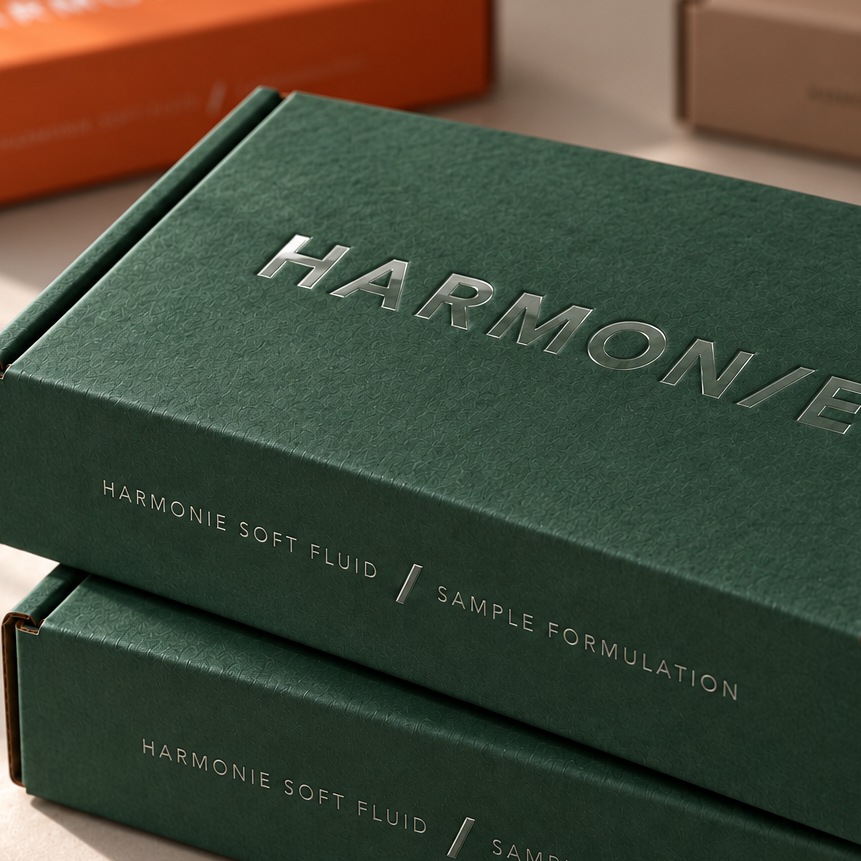
Green brings the natural feel, while black gives the identity definition and contrast. A hint of orange connects Harmonie back to the Momentive logo. On the formulation sample boxes, clear raised spot varnish replaces coloured ink in the lettering. The words emerge as light moves across the matte board, reflecting the idea of an invisible formulation whose effect can be felt.
[04] / IN THE WORLD
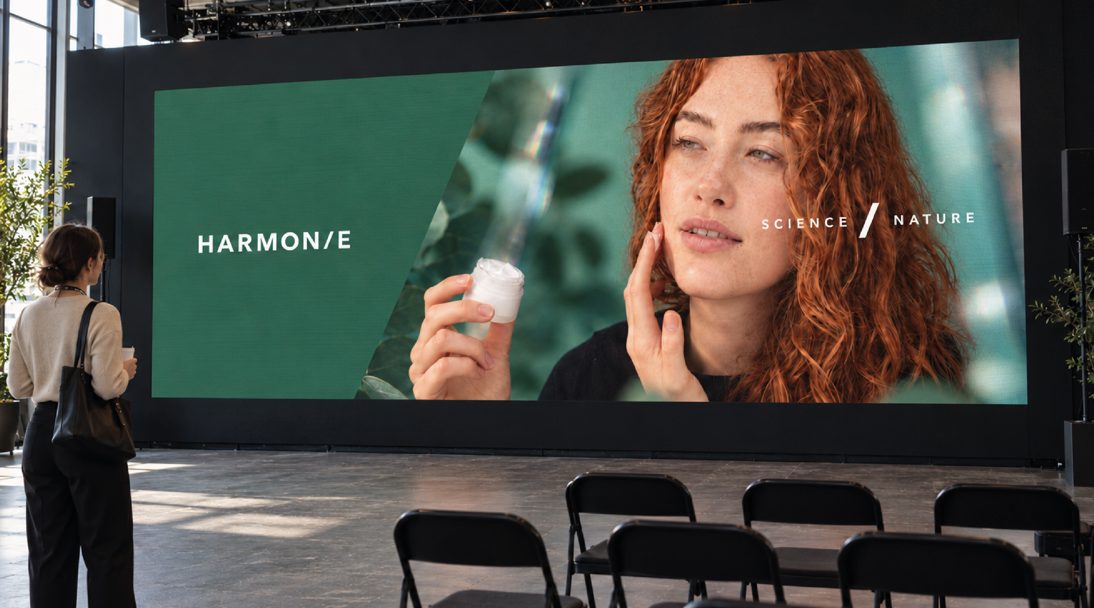
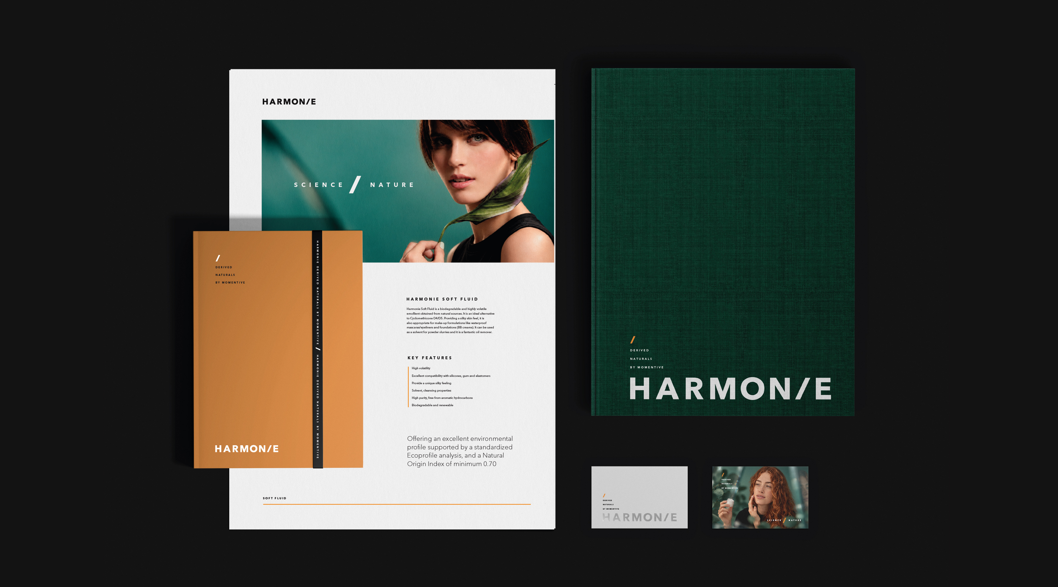
One identity, across every application
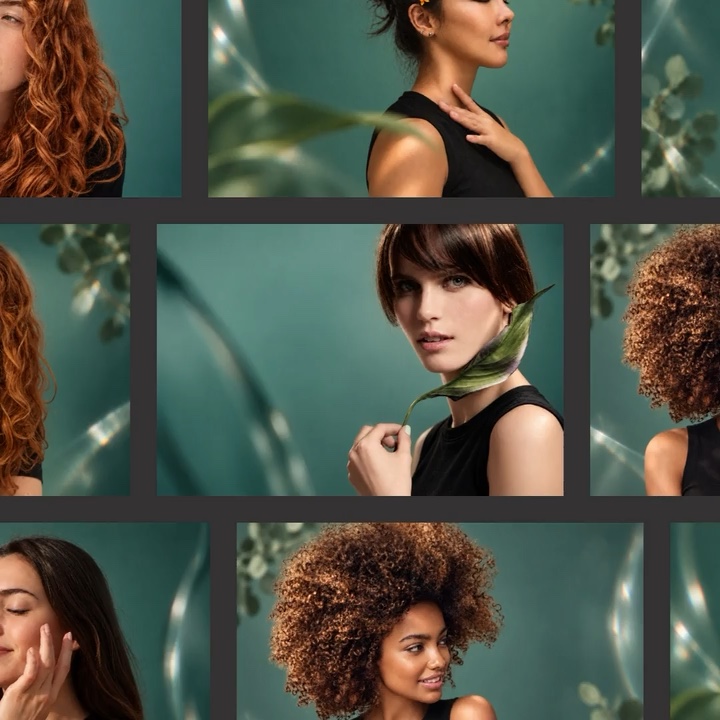
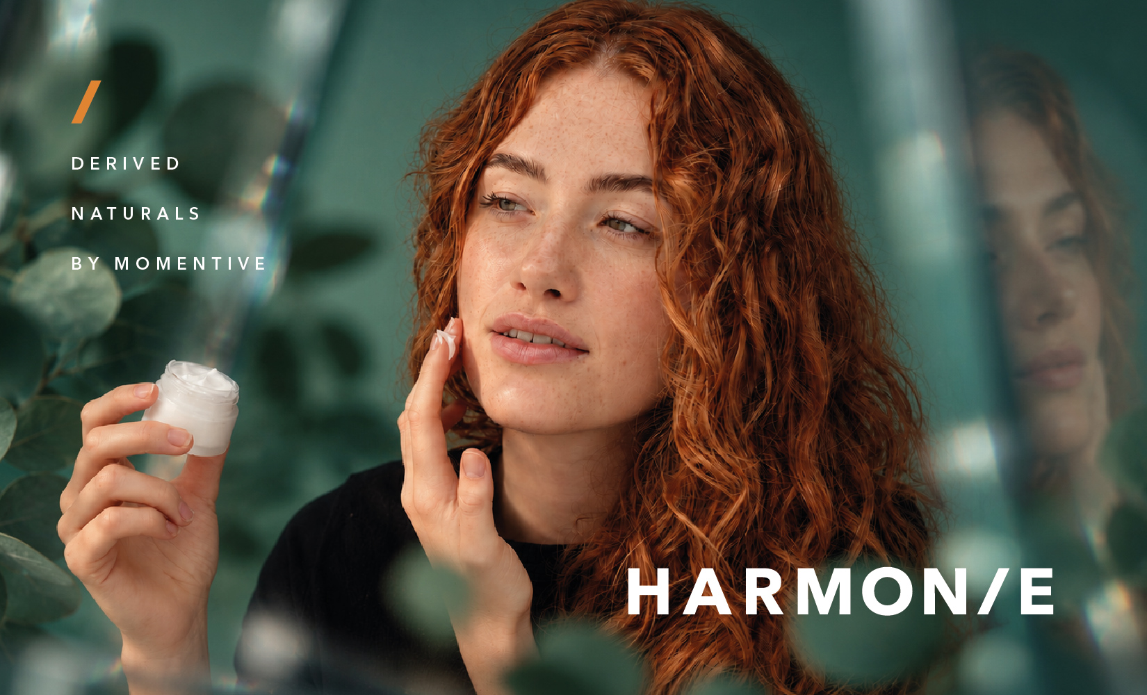
We began with a photoshoot featuring one model, establishing the visual approach for Harmonie. We then adapted that approach to other stock photography, using consistent treatment, foliage, light and the green, black and orange palette to bring the images together. This gave the brand a recognisable photographic style that could extend across different beauty applications. The same identity carries through formulation sample boxes, printed literature, website layouts, social content and event graphics, helping Harmonie stand apart in the beauty ingredients market.