Behind the work
The Helm: a cocktail range with character
Refreshing design for a cocktail brand that refuses to blend in
The challenge
The Helm needed to establish a range of ready-to-drink cocktails in a crowded category. Each flavour required its own personality, but the full collection still needed to feel like one confident and recognisable brand.
The thinking
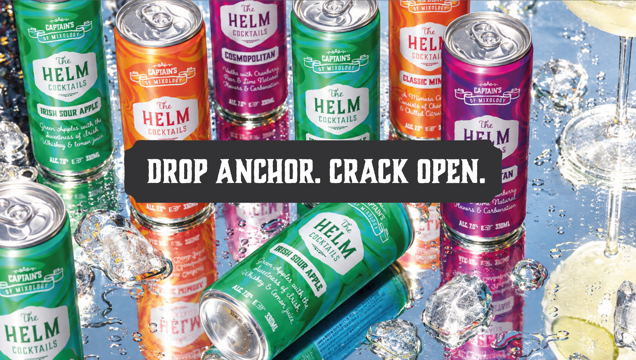
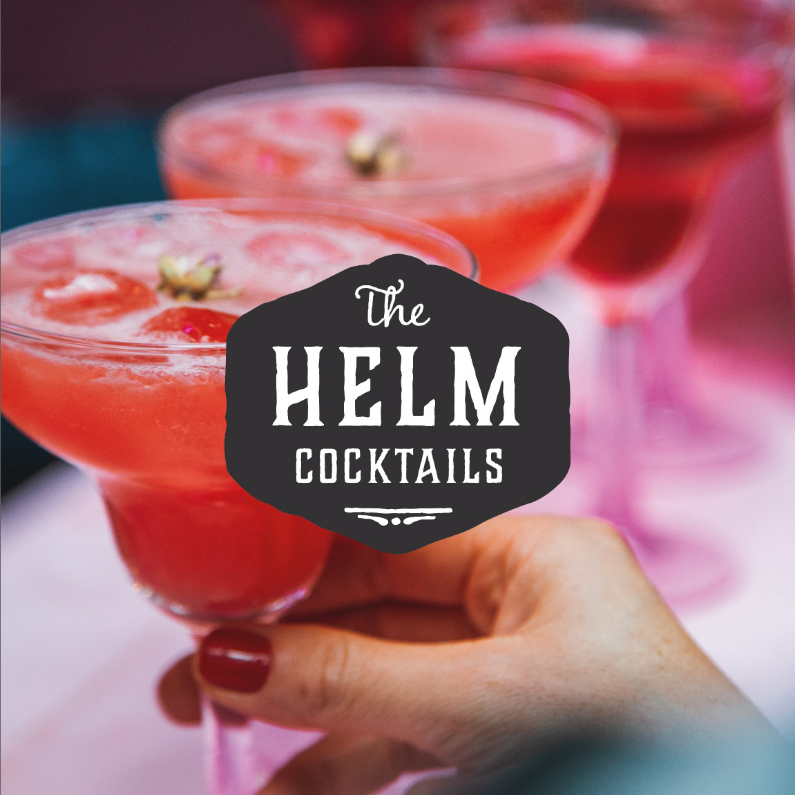
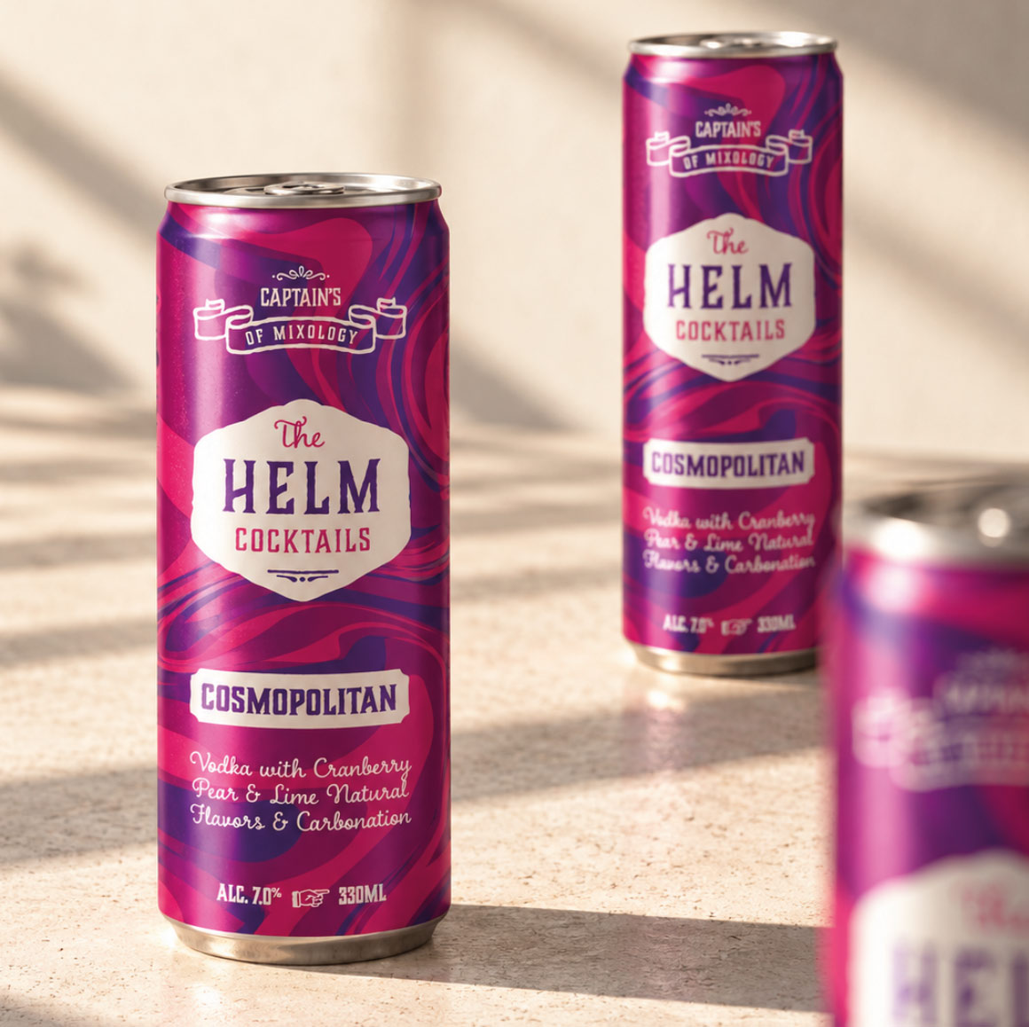
The design used bold, flavour-led colours, rolling graphic patterns and characterful typography to give the brand energy and movement. A consistent badge and layout system connected the range while helping customers distinguish between cocktails quickly.
The work
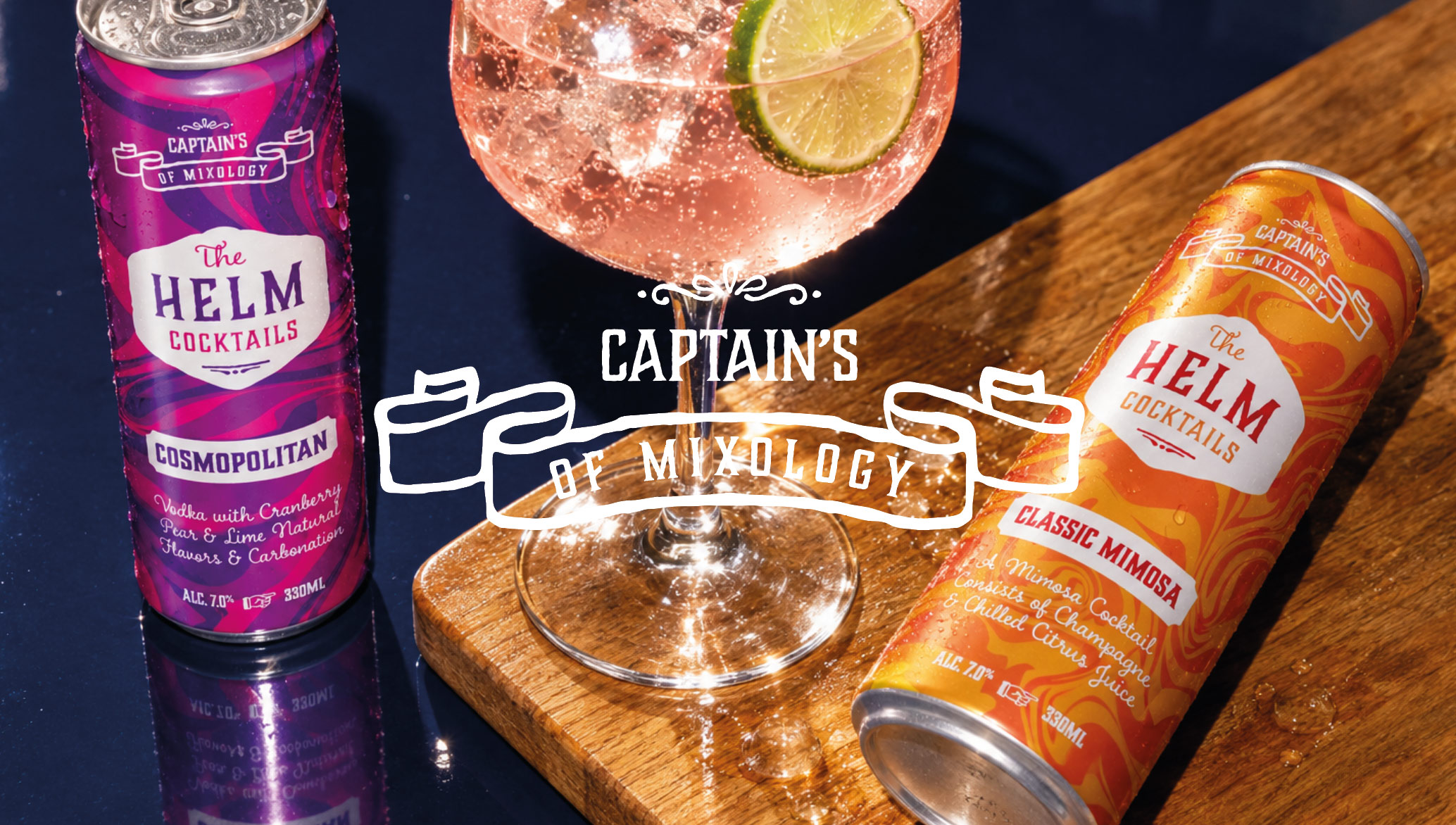
The project covered the packaging identity, can designs, product hierarchy and the visual system used across the complete cocktail range.
The rollout
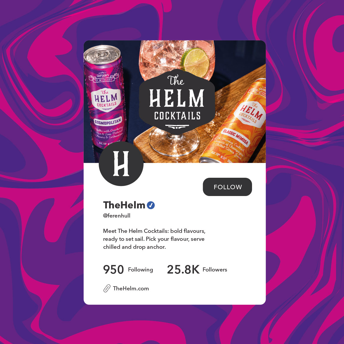
The design was adapted across different flavours and recipes, from Cosmopolitan to Classic Mimosa. Colour and pattern changed to express each drink while the underlying system kept every product unmistakably part of The Helm.
The outcome
The finished range has greater shelf impact, clearer flavour navigation and enough flexibility to support new products without weakening the overall brand.